Spectrum analysis in 802.11 design is extremely important. Detecting which channels are in use in 2.4 and 5 gig spectrum’s as well as the channel density is a great help when channel planning or troubleshooting wifi issues. There are lots of graphs within any spectrum analyzing software. Below are a few that I feel really help narrow down issues within spectrum.
FFT Graphs
FFT stands for Fast Fourier Transform – Which is an algorithm that samples signals over a period of time. One of the most usable graphs when looking at the spectrum is the FFT density graph and the real time FFT graph. I am currently using Fluke’s or now NetScouts SpectrumXT.
The below images shows the FFT of our office. As you can easily see just from the FFT graphs that channel 124 and 128 is heavily in use. This is because of a few reason – 1 we are using 40 MHZ channels so channel 124 and 128 are combined. 2 – the AP using these channels are the closest to me, the other APs are pretty far away.
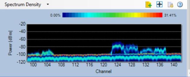
So why is this important during a survey or just checking to see whats going on – its important because it shows the amount of energy used on those channels. An abundance of energy will cause slowness and clients to defer sending as well as packet loss. Understanding and viewing spectrum is also extremely important in channel selection and design.
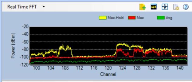
So lets compare the above with the Real time FFT – the Real time graph changes as the name states very often. But the Density and Real Time should be pretty similar. For channel planning purposes you can easily recognize that channels 124 through 136 should not be used. Lots of channels are open and can be used in this range that will not cause any interference.
Spectrogram
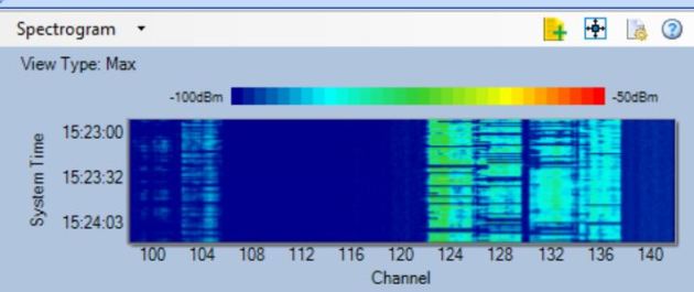
The next graph is the famous Spectrogram. The Spectrogram graph shows the amplitude of a signal over time. Basically it shows how busy and strong the signals are on that channel. These are also know as sweep or waterfall graphs. This graph shows how much signal density is on that channel. For example, if you have a channel maybe 104 that has traffic on it (seen by FFT), but its usage is very low (Spectrogram) then we know that that channel even though used would have very low interference, where as Channel 124 has lots of traffic and usage.
In the following graph the darker color shows more usage, notice Channel 124 which my STA is on.
 .
.
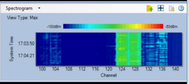
The following graph shows the spectrum after my station starts downloading a huge file on WIFI. Check out the difference in usage.
There are a lot of spectrum analysis graphs some are very helpful. These are two graphs that I find that help a lot to pinpoint the usage and channel use/layout of a wireless network. There are many more helpful graphs such as the wifi integrated graphs that can collect retries, Channel SNR, etc.
